Saturday 23 October 2010

Drawn Story Board (1min)

As part of our planning for our final assessment piece, we needed to draw a 1 minute long storyboard. This 1 min has got to show all the basic shots and approximate shot lengths. I decided to take the 2nd minute of our film.
The storyboard begins with our main character sitting in her chair watch the home video that her mum left her. However, for some unexplainable reason the screen freezes. This first shot is then followed by a close up of the victims face, which shows confusion. This is followed by a shot where she goes to the television to see why it has stopped working. She tries to press play on the remote, however this doesn't seem to work, so she unplugs the TV and walks out the room.
The second half of the storyboard starts with our victim deciding to leave to go to her mums grave. This is shown by a 'mid shot' of her walking to the front door from the living room. This is -followed by a 'mid-close up' of the victim picking up a bunch of flowers and her keys from the table next to the door, to indicate that she is going to her mums grave. After this we get a shot of her leaving the house and the door shutting behind her. We then get our first sense that there is something not quite right in the house, because as soon as the victim closes the door, the TV turns back on and continues to play even though it has been unplugged. We are then left with a close up of her mum finishing the home video with a message that reveals something shocking to the audience. After the scene at the house, we go straight to the graveyard. This is shows with a long 'long shot' which tells us where the next scene is taking place, and also reveals a strange figure who has just come from the victims' mums' grave wearing black.

Friday 22 October 2010

Pitch

Film User Ratings

Another exercise which allows us to consider our
target audience is to look at the user ratings on IMDB of several films of our sub genre.

This first graph shows the data for the 2002 horror film 'The Ring'. It is obviously fairly quickly that this film is much more popular with men than women, which may be seen as the stereotype with films of this sub-genre. Furthermore, the age groupings show that the most votes were cast for people between the age of 18-29, which again fits with the classic target audience. This was certainly the information we hoped the find, as our target audience will be the same as that of 'The Ring'.


The second graph shows the user ratings data for 'The Grudge', starring Sarah Michelle-Gellar. Similarly to 'The Ring', it is the male audience that have largely viewed this page, and the males aged 18-29 are once again the largest sub-section. Furthermore, the males aged 30-44 (which had a big further for 'The Ring') have a large effect in this graph.


One of our favourite psychological horrors that we used as research was Steven Spielberg's 'Poltergeist'. As with the previous two, there is the common audience of males between the ages of 18-29 and 30-44. However, one slight difference is that this film appears much less popular with females than 'The Grudge', and this may be down to the protagonist; Sarah Michelle-Gellar plays the main character in 'The Grudge' whereas there are several protagonists in 'Poltergeist', and possibly less emphasis on young women. This supports our choice to place a teenage female as the main person in our film.


The final film which we researched on IMDB was the classic psychological horror starring Bruce Willis, 'Sixth Sense'. Firstly, it is obvious to see that this film is without doubt the most popular of the four that are on this post, and yet it still supports the classic demographic which has been a constant in all of our films, with males making up the majority of viewers and emphasis placed on those of a younger age.

Using this information, we can see that aiming our horror at a younger audience (between 18-35) may well provide most success, as well as choosing a female protagonist, which may well appeal to both sexes.


Classification

As we are making a horror film, we realised that classification was a rather important and slightly controversial subject. In this post we will illustrate the subtle differences which make the two guidelines slightly different.

Obviously, a film which carries a 15 certificate should not be watched by anyone under the age of 15. The basic guidelines suggest that controversial areas such as sex, violence and drugs may be shown regularly so long as they are not overly done (or in the case of drugs, not shown to be endorsing them.)
In the case of horror themes, 15 films are fairly flexible in showing any menacing scenes, unless these scenes are deemed as sadistic.


18 is the final classification (excluding R18), and states that only people over this age are permitted to watch these films. The main difference between this classification and the one before it is links to sex: in 18 films, sexual scenes can be much more visual and possibly crude. Some of these films may be seen to be pornographic, and so are deemed 18. However, there are very few other differences, which leads us to the conclusion that our film (which will not include sexual references) will be classified as a 15.


Textual Analysis


Step Outline (13th October)

Description of what is happening scene by scene

Number of shots in this section

Average length of shot

  1. Home video scene: mum, who is dead, leaving main character a message.

Titles at the bottom of the screen

Ending with the Title of film at the end of the home video

APPROX-1min

3 shots – 3/4secs each approx

4/5 shots – 7-10 secs each approx

  1. Intro of main character

Getting ready to go to mum’s grave

Start of supernatural activity

APPROX-45secs

7 shots – 3-9 secs each approx

  1. Long shot/graveyard scene

Main character at the graveyard

Long shot of her going to grave

Including unknown hooded figure

APPROX-1min

2 shots – 8 secs each approx

4 shots – 2-4 secs each approx

3 shots – 7-10 secs each approx

  1. House scene

Main character returns home

Supernatural activity increases

High angle shot from top of the stair case

Hooded figure seen at scene 3 at the end of the garden

APPROX-2min 15sec

4 shots – 3-8 secs each approx

3/4 shots - 2-6 secs each approx

2 shots – 10-15 secs each approx

2/3 shots – 3 secs each approx

Wednesday 20 October 2010

Lighting Lesson Photos

This first photo shows the use of just one light: the key light. It is focused on one side of the characters face, thus creating dark shadows both behind him and on the opposite side of his body and head.
This second image is again created through the use of solely one light, which in this case is the back light. The character stands straight in front of the light to create one large shadow. This technique may be useful in our horror film to create areas of darkness which may be able to move and therefore create tension.
This image shows the use of a red gel, which is placed in front of the key light to alter the colour of the shot. It creates a rather evil, sadistic effect, and with the addition of a fill light, one side of the face is more lit than the other.


This final image shows the use of a fill light (torch), which has been placed behind some paper so as to distribute the light more evenly, stopping the harshness which may come with just the torch. In this case it has created a half of light and a half of shadow, which may well come in useful with our horror.

Lighting Lesson

One of the most vital aspects of cinematography is lighting: without decent lighting each scene will look amateurish and it may lose some of the effect which was intended. By using light in the appropriate way, it is possible to add tension and emotion by creating shadows and definition.

One of the most basic lighting techniques is '3 Point Lighting'. Although this method may not be particularly useful in the genre of horror, it can allow you to shoot good quality scenes. Its name is relevant to the technique, as three separate lights are used to illuminate the character, prop or setting.
The first light is called the 'key light', and this is the main source of illumination. The key light is usually placed at around a 45 degree angle away from the camera and is focused on the subject of the shot, brightening the face.
The second light is called the 'fill light', and this is there to accompany the key light. The fill light may be situated 45 degrees in the opposite direction from the camera, and its function is to eliminate shadows which may be created by the key light. It must also be less intense (so possibly placed further away) to ensure that there is not too much light.
The final light is placed behind the subject, and so is aptly named the 'back light'. This serves the purpose of eliminating the prospect of lack of definition or dimension with the character in shot, and so it defines the shoulders and head of a person to make them look 3D.

Obviously, although all three lights can be used simultaneously, it is often possible to use just one or two which can enable the creation of various effects. One good example which we are planning on using in our horror is to solely place the back light behind the character as she enters a room; this will create a silhouette of the girl, as well as shadows around the door.

Monday 18 October 2010

Title Sequence Research

The main purpose of this exercise was to research and watch several horror film/TV series title sequences, giving us the opportunity to see what is common in each, as well as take inspiration in the way that these are created, such as from the images, music and composition. The films we watched were 'Dawn of the Dead', 'Blade II', 'True Blood' and 'Halloween'.

Evaluation of Previous IB Work

Although we had begun to have ideas about how our film would be shot and created, we were still rather unsure as to what is expected of our films and their quality. In this exercise we watched several films created as part of the IB Film Studies course, and then evaluated them for aspects such as composition, continuity, shot types and originality, before scoring each out of 30 and then discovering the actual mark which each received. After doing this exercise and seeing the results, it made us feel a lot more confident!!!

Narrative Analysis Chart


Evaluation of Assessment Horror

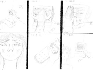
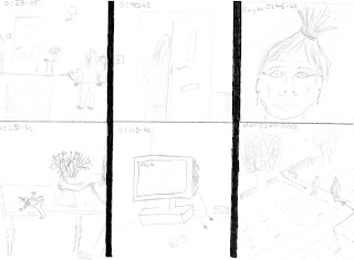
The final exercise we were set to utilise the skills we had learnt throughout the previous weeks was to recreate an existing horror film (of our sub-genre) which had been created by students of our college. The short film, which follows a basic plot not uncommon to the one that we are looking at creating, was based on psychological elements.
Our task was not only to re-shoot the piece in our own way, but also to edit it so as to have a complete recreation.

The narrative of the original short film is fairly simple: after looking at an 'evil' book, a girl becomes haunted in her house, and searches through rooms to try and find her missing boyfriend. If we consult both that film and our recreation, it is clear to see that the plots are very comparable, with only main difference in that the protagonist's friends are females.
The main differences lie with the varying shots which we decided upon ourselves as we were not completely happy with those in the original. However, occasional shots (such as those down the hallway and in the mirror) are the same, as these create tension or shock the audience.

As the cinematographer of our group, I took the lead in filming our recreation, and so I spent time over the location of each and every shot taken. One of our main aims was to use all the shot types that we had been taught in previous lessons, and I believe we used these to good effect: from the close ups of the girl's eyes to the long shots in the hallway. As well as different length of shots, we used panning, some tracking and varying height of shots to create a sense of loneliness and isolation for the girl. This is best shown in the low angle shot as she walks up the stairs, where the continuity is also excellent.
Unfortunately there are times when shots lacked professionalism, such as in the use of zoom which looked ineffective. This is something which we will attempt to eradicate when we film our final piece, as the camera shots appeared shaky, such as in the bathroom. Also, some shots lacked the quality finish that we would have liked, and we will learn from these. Some of our best shots include the scene in which the girl walks up the stairs, as well as when the girl consults the book. The continuity in the entire film varies massively, although on the whole we allowed ourselves enough shots to keep the film flowing. An improvement that we will make in the future is to take more shots at different angles to allow ourselves more choice in the editing suite.

The composition of the film is something that we knew was very important. To ensure that the film was set out in an aesthetically pleasing way, we used the rule of thirds, which worked to effect in the scene where the girl leaves the bedroom. Composition also meant that props (such as the mirror) were used to good effect, which we believe they were.

The mise-en-scene was something we could have planned for longer, and yet it still worked well. The props, including the book, were relevant to the genre, as was the location, but the lighting was most impressive. The fact that each scene had a hint of darkness and shadow continued to sense of tension and fear throughout.

Overall, our recreation was not only relevant to the original, but showed good continuity, composition and originality which bodes well for our final piece. Despite this, there are things we which will improve on that we learnt when watching back the film, such as the occasional poor shot, but mainly to ensure that we do NOT use the zoom feature at all, as this looks amateurish. Finally though, it was a very good attempt at our first piece, as we know that we can improve in the future.

Josh Murray

Saturday 9 October 2010

Analysis of Horror assessment

Analysis of Horror assessment

Introduction:

As practice for our final assessment piece for film we had to remake an existing horror which was made by previous students. After careful planning we managed to shoot the horror, which has a similar plot to the one we were meant to recreate. Then I edited the shots we had taken and put them together to get the best possible ‘continuity’ throughout the film.

Analysis:

If we compare the remake to the original we can see that it has a similar plot and has similar features. The story in both versions is a book which is haunted and causes supernatural things to happen. The main character loses her friend (s) and ends up seeing them dead in the bath. The sequence ends in the bathroom with a shot of her friends alive in the mirror.

The core of the narrative plot in both versions is a sequence of shots taken in the hallway, using close-ups and shots of a long duration to show fear and to build tension.

There is a good variety of shots throughout the film. We managed to put together shots from different angles inside and outside the house, use mirrors to great affect and use close-ups and mid-shots where we thought most appropriate. However, I do believe we could have added some more shots. A high angle shot looking down the stair case could have show how the main character was inferior to the supernatural things occurring in the house. Also, on some shots we zoomed in on characters. This was not very affective in our film. When getting to our final film, we will look at getting rid of these errors. Finally, more shots would have helped with the editing. I feel like we didn’t have enough shots to get perfect continuity. At times (shots of girl walking up the stairs) the continuity was excellent, however, others (girl running down the hallway) weren’t. There aren’t many jumps in the film apparent to the viewer, but I think we still could have made it a lot better with more shots

We succeeded in having good composition throughout the film. The shots include the most relevant elements to the plot. We used the rule of thirds well and made sure that our shots looked picture perfect. Our close up of the hand looking for the die underneath the sofa is probably our best shot, but most of our shots looked very nice.

This ties in well with the mise-en-scene. The light, setting and objects all included in the film were relevant to our horror. Although the light effects which we used were very basic, in the end the film as a whole looked good. We didn’t use very many props; we only used a book and a knife. These were appropriate to the horror genre.

The location we used was also appropriate to the film. It made the main character feel like she was trapped in the narrow hallway and scared in the dimly lit lounge.

Conclusion:

In conclusion, the film looked good, but we still have many things we can improve on. We affectively went from a period of equilibrium to distortion. We built up tension through a series of fast and long shots and used lighting and props well to represent our horror in the right way. We can improve on the quantity and variety of our shots through longer planning. In the end, though, I believe the film worked and it was a good effort for our first film.

Sam Van de Schootbrugge-incentive

Wednesday 6 October 2010

Assessment video horror

As part of the preparation for our final piece, we were made to recreate a previous short horror film of the psychological genre. In this video, we have completely re-filmed every shot, changing certain aspects to make the film more appropriate to us, and then edited to give a complete assessment piece.
The main purpose of creating this video was to allow us to view both positive and negative aspects of our filming and editing techniques, so as to know what to improve before filming our final horror.